Diwine is a Pinot Grigio Rose product in California. The intention working on this project was to create something that emphasize the wine and the very material aspect of wine production, the artisanal work in creating wines. I could say ‘Craft meets Design’.
The target of this product doesn’t have a specific gender, and the product takes distance from stereotype. We’ve all heard the clichéd thinking that women like lighter, sweeter wines while men prefer big, bold and prestigious. Or that sparkling and rosé wines are for women, and men only go for the reds. But research (and common sense) says otherwise. Wine Preference is Individual. Not Male or Female.
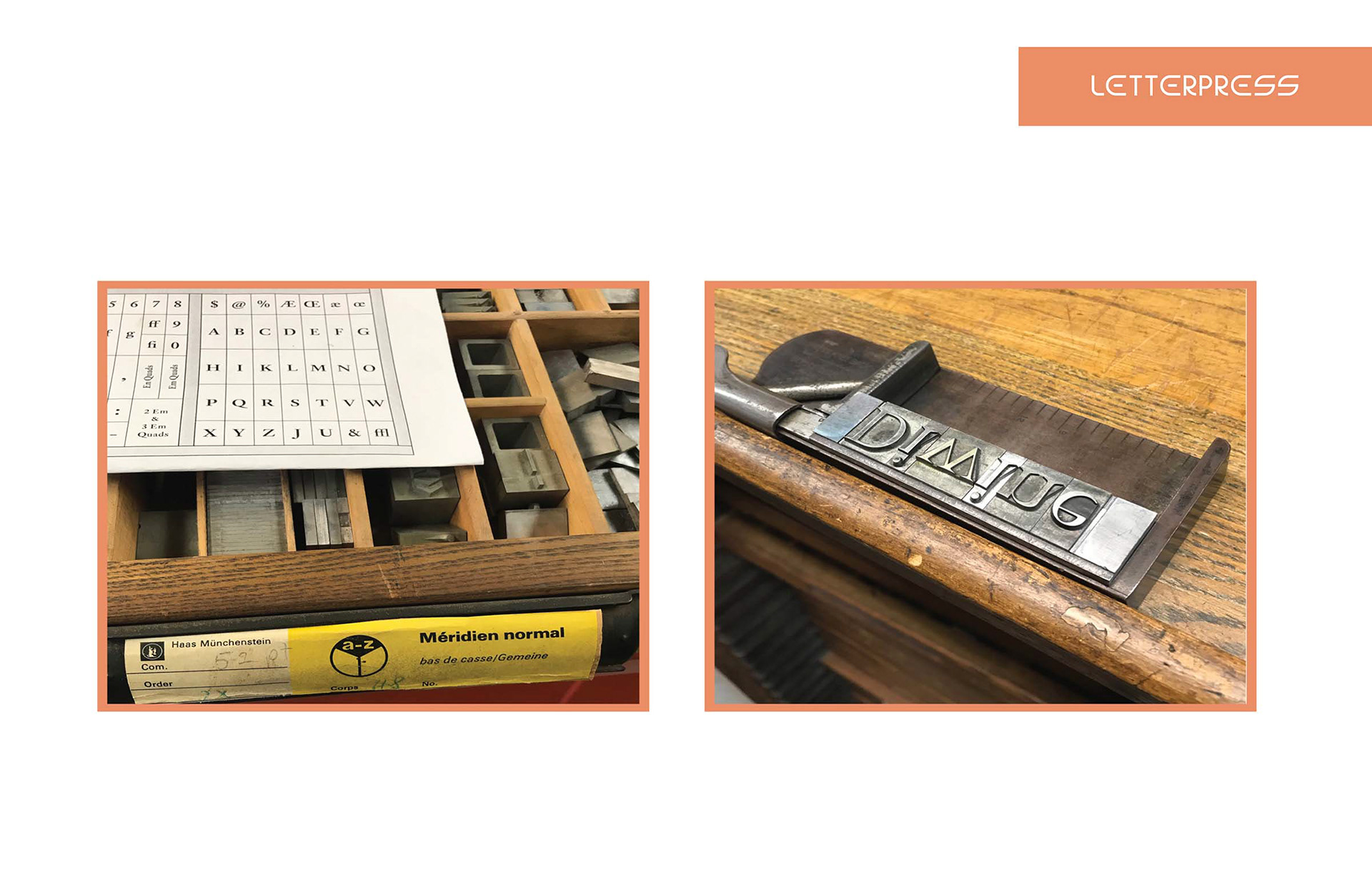
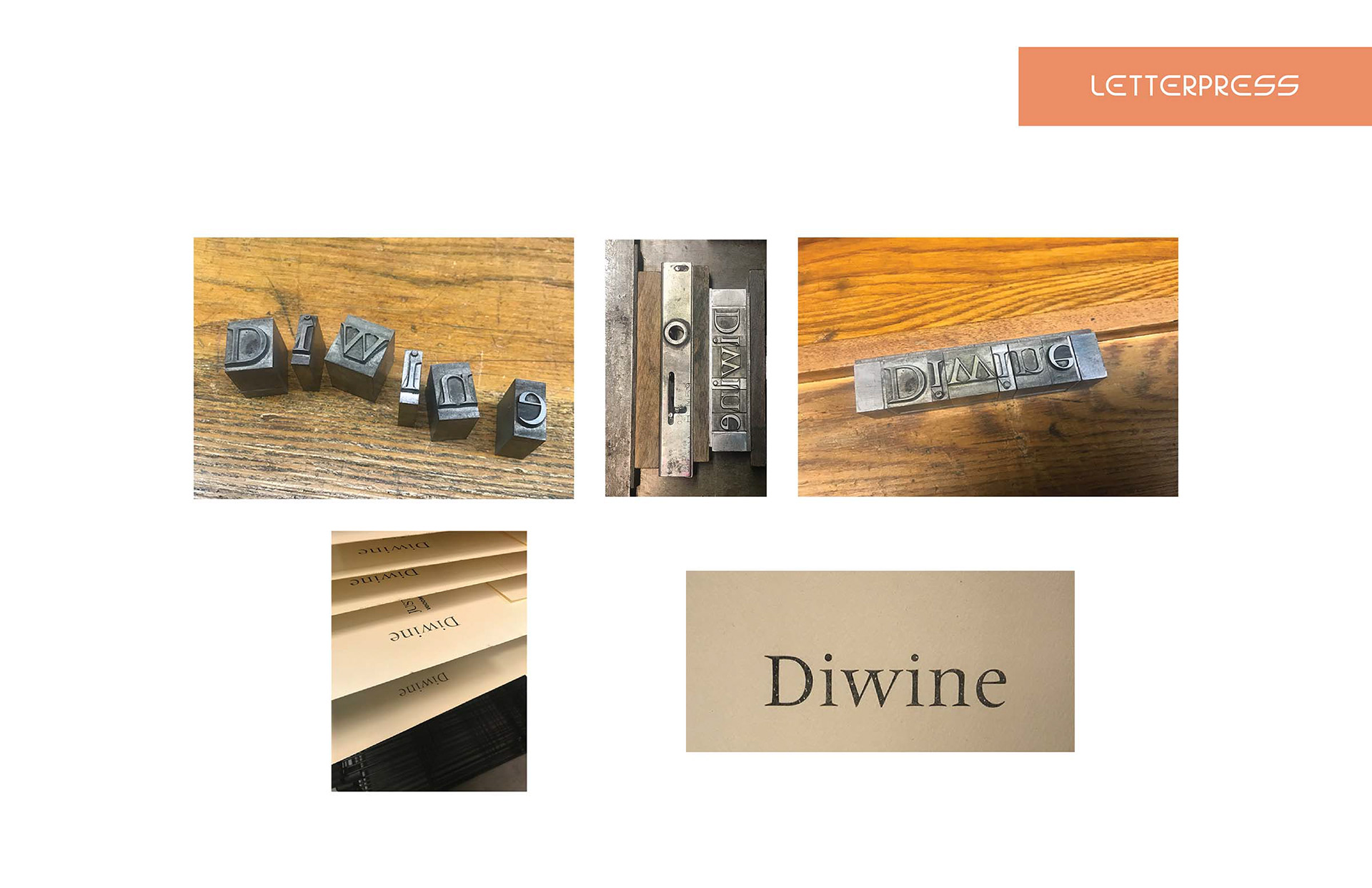
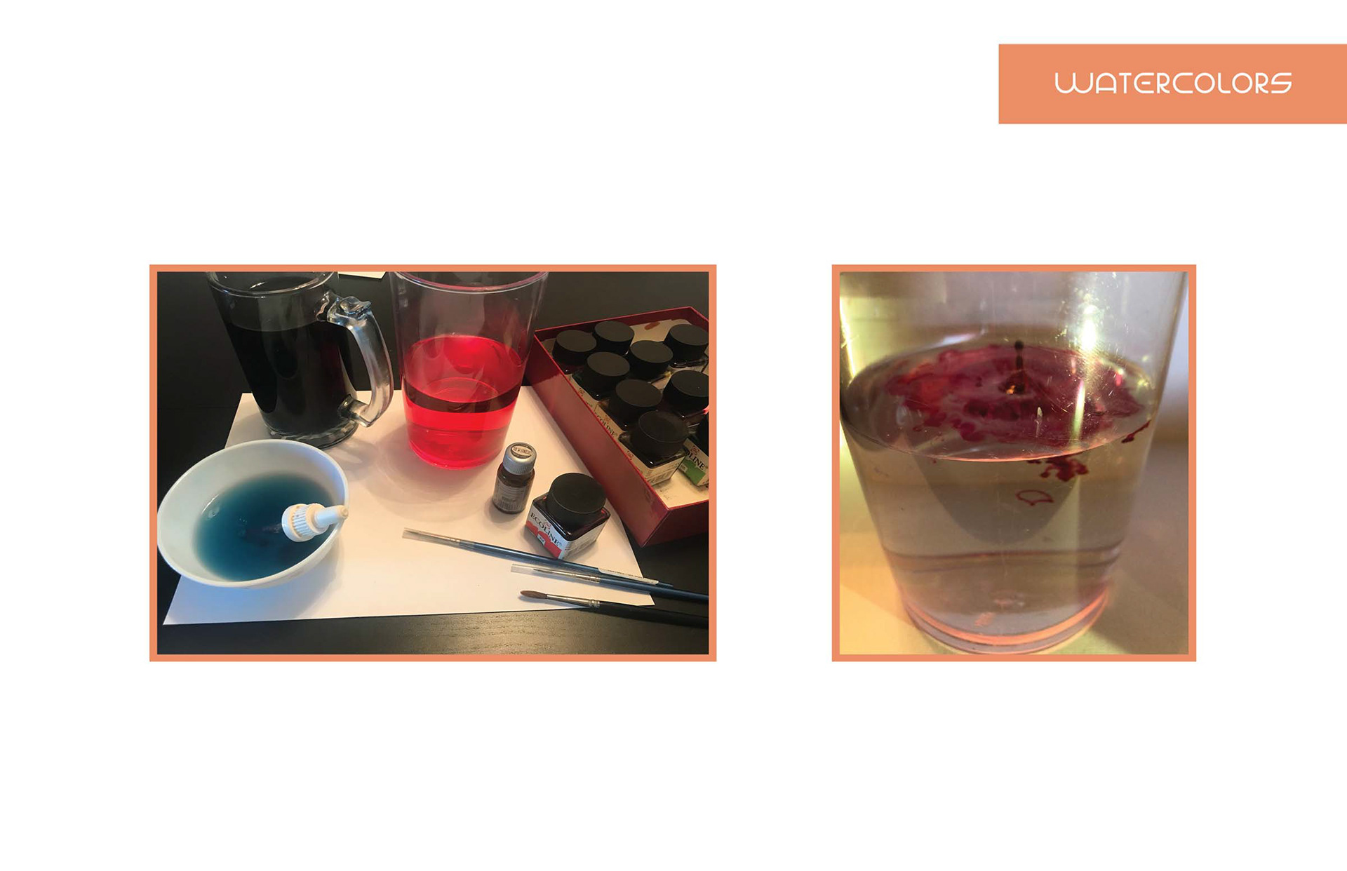

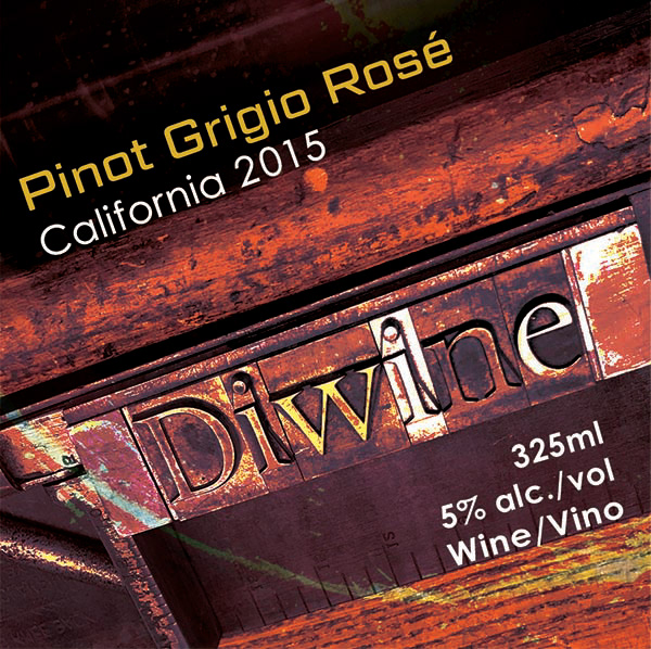

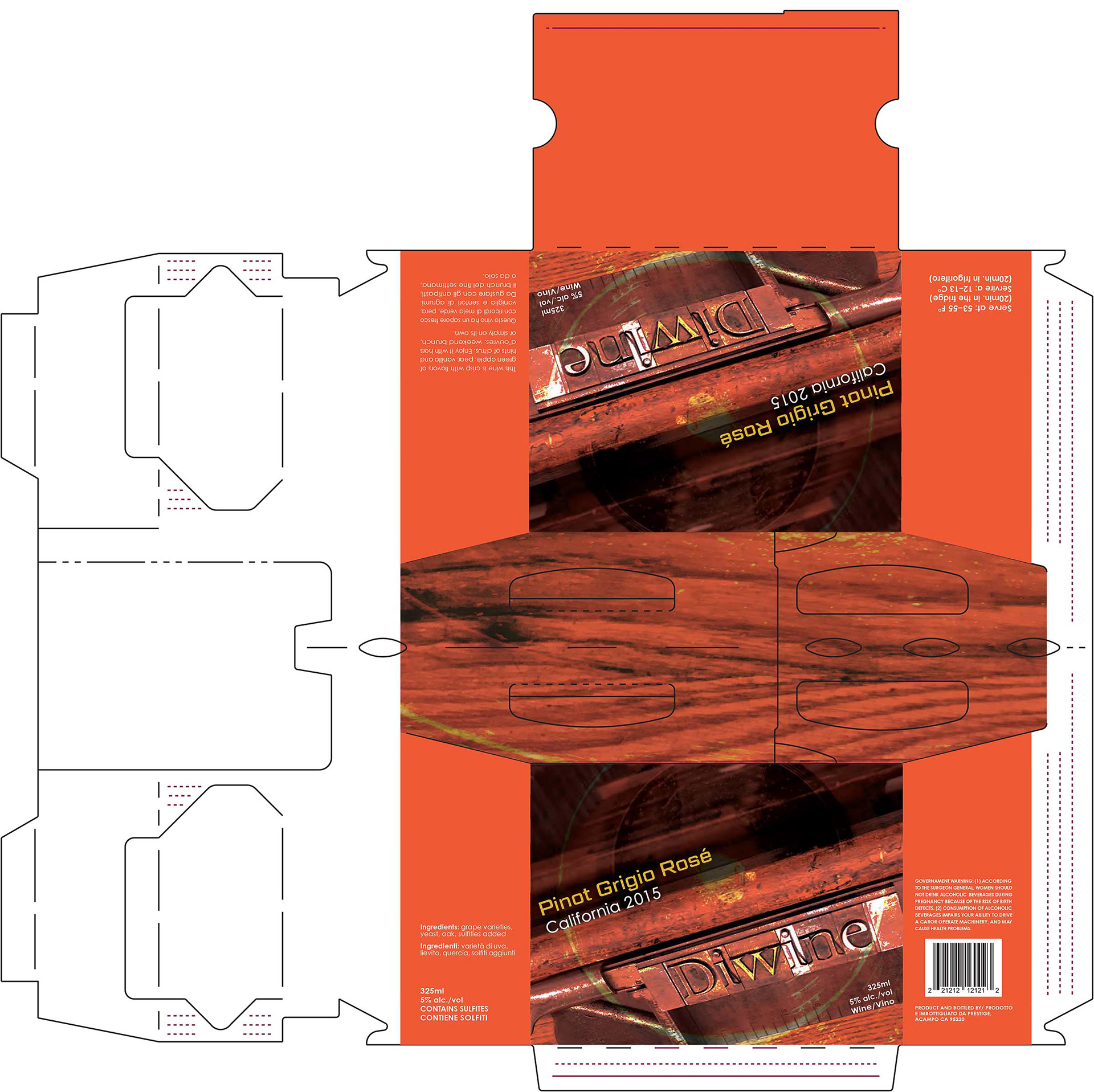
The design shows in fact, something that moves away from the labels of rosé wines that are always very pink and pastel. The photo itself wants to evoke an idea that gives value to the historical aspect of the wine tradition. This photographic approach comes from the desire to create a strong texture mixing a series of very different techniques. On the one hand the transparent and colorful universe of the Ecoline (liquid watercolor), immersed in water and oil to monitor the evolution and the movement through the photographs. On the other the use and exploration of the ancient art of Letterpress printing enhancing qualities of wood and metal typefaces.
The choice of the chromatic range of orange, brown and yellow points then to exploit and at the same time harmonize with the color of the wine visible inside the bottle.
The deliberately modern combination of a typeface such as the Century Gothic Pro, a sans serif typeface with a geometric style, wants to create a strong contrast with the photo of the typeface prepared for the letterpress, giving greater readability to product information.
In conclusion, the design of this product has determination, temper and wants to be original.