This campaign is to create awareness about the Pink Tax that refers to the extra amount of money women pay for specific products or services. Sometimes you’ll see or hear it referred to as price discrimination or gender-pricing.
The intent is to retort the brutal facts, differing from using just pads or tampons to highlight these issues, to emphasize broadly the concept of women's discrimination present on products and the gender pay gap. Therefore, this advertising campaign is proactive— bright and bold and conveyed on posters, newspapers, social media, etc.
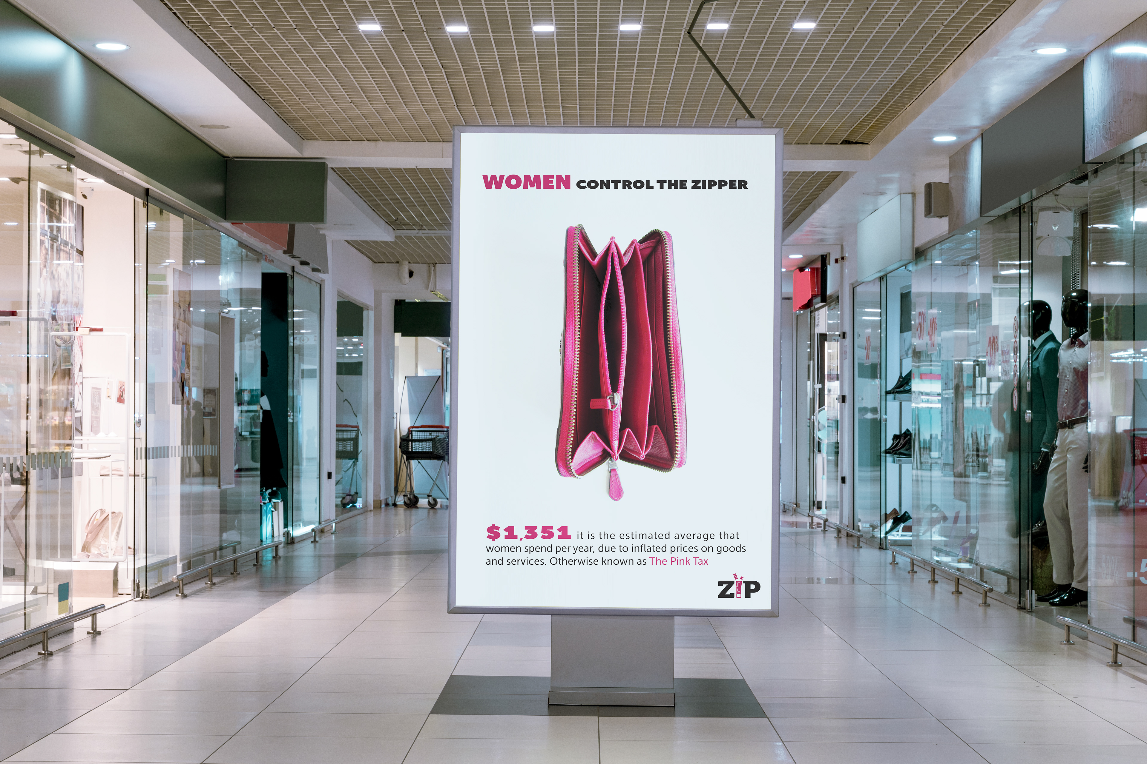
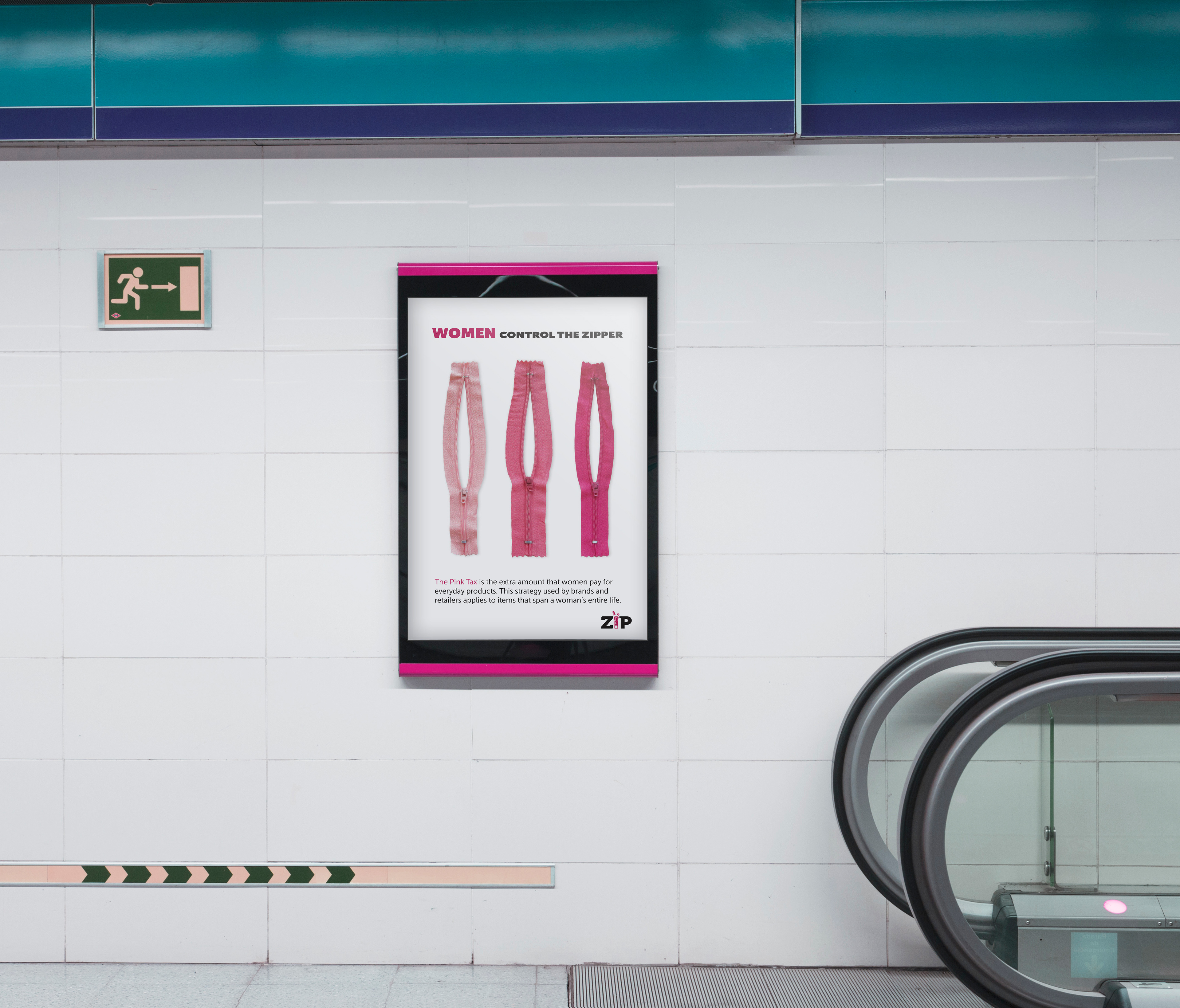
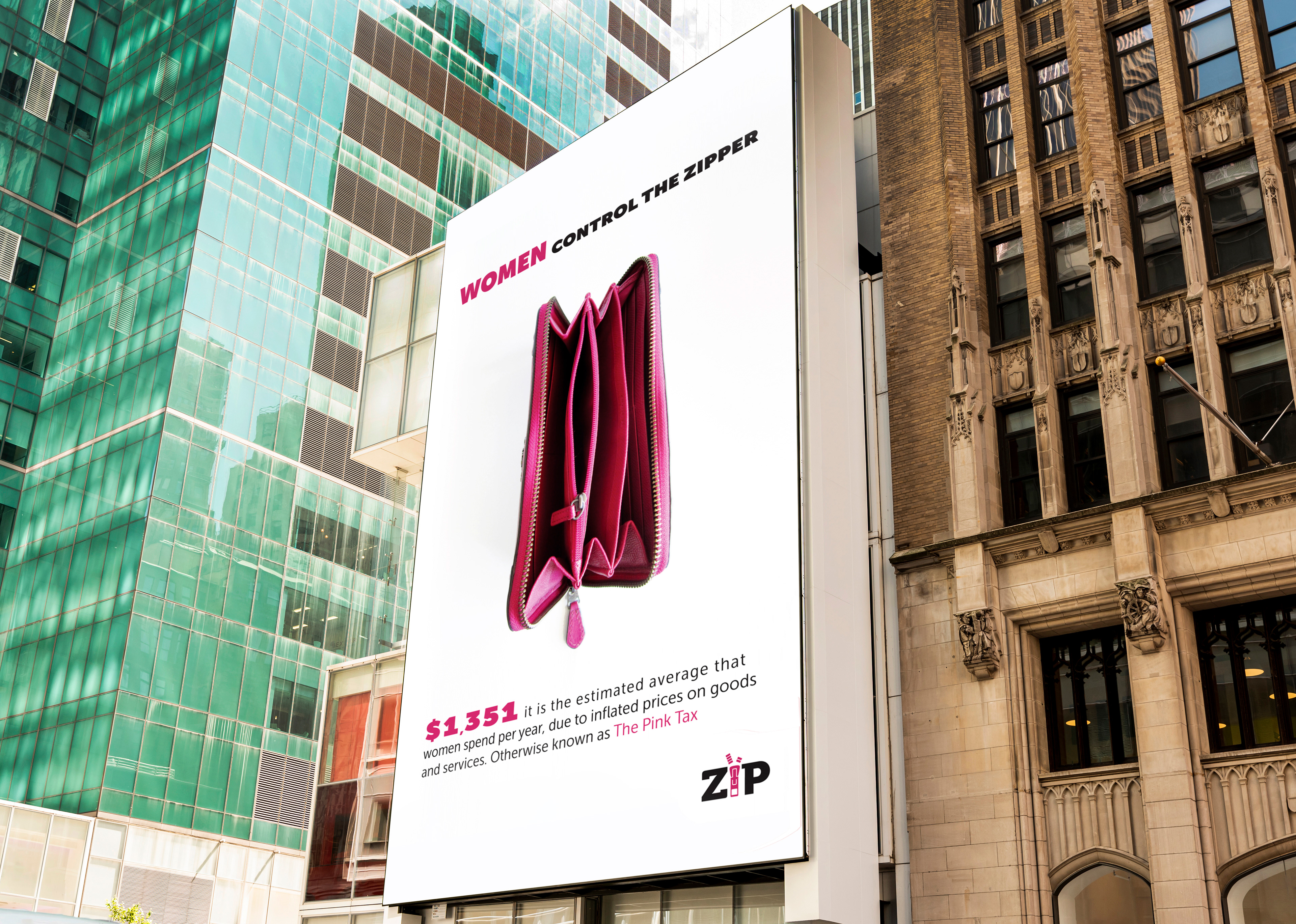
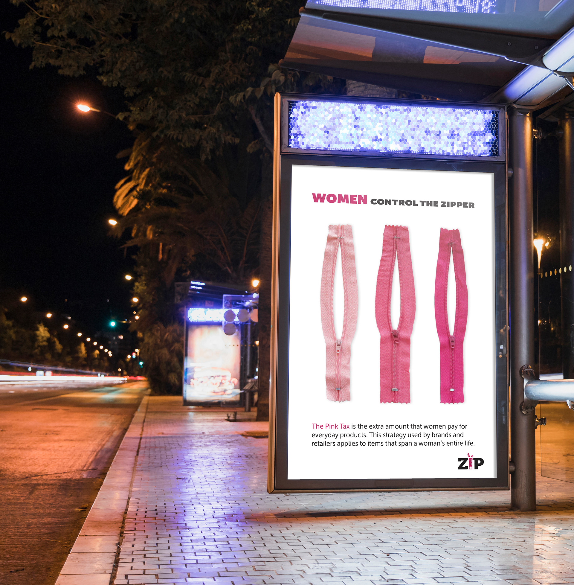
If the role of women is often stereotyped beyond measure, the zipper becomes a symbol that visually recalls the shape of a vagina but also conceptually represents the purchasing and decision-making power of the woman. The zip is, in fact, something we use every day to open or close clothes, bags, and wallets.
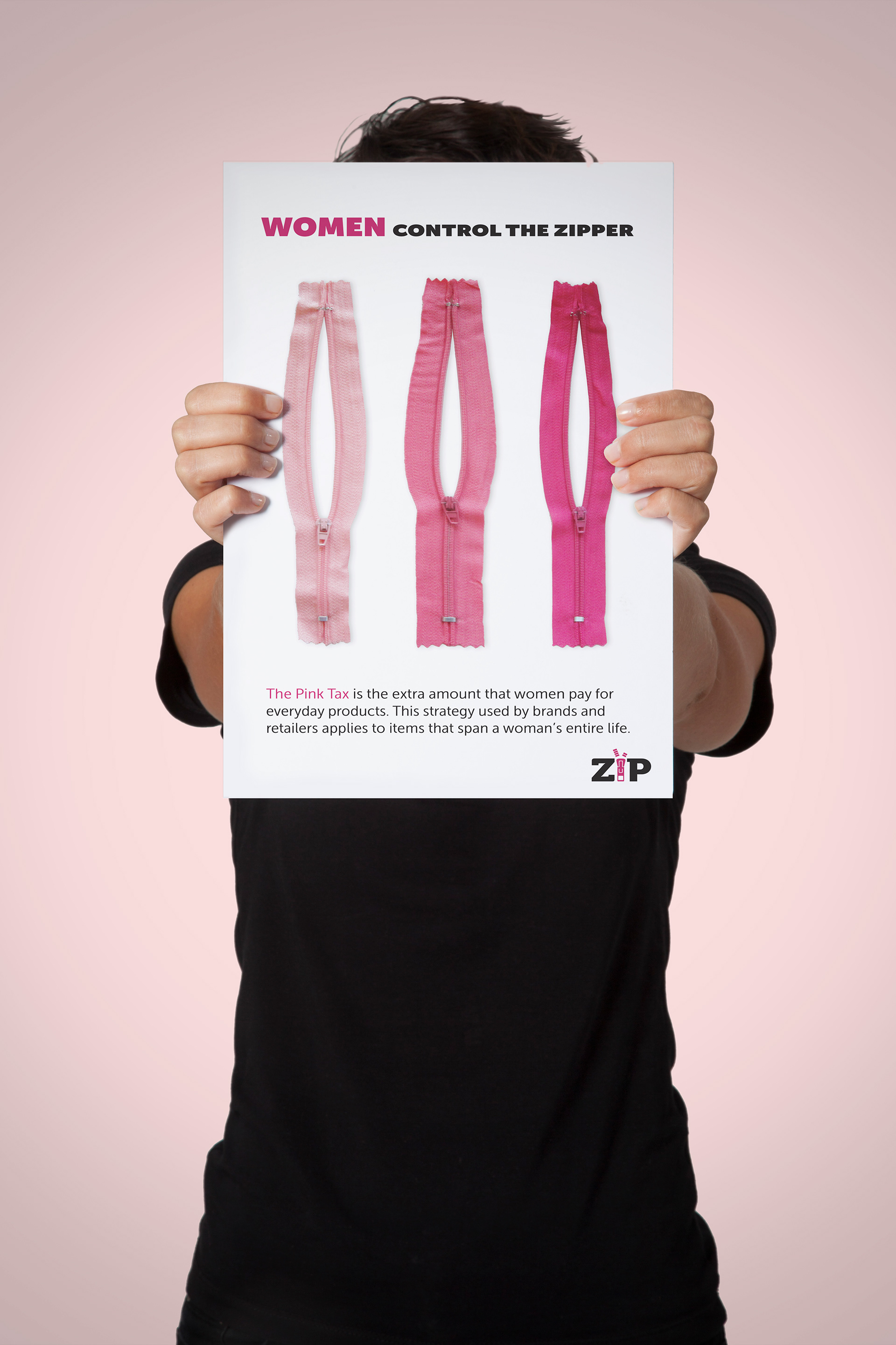
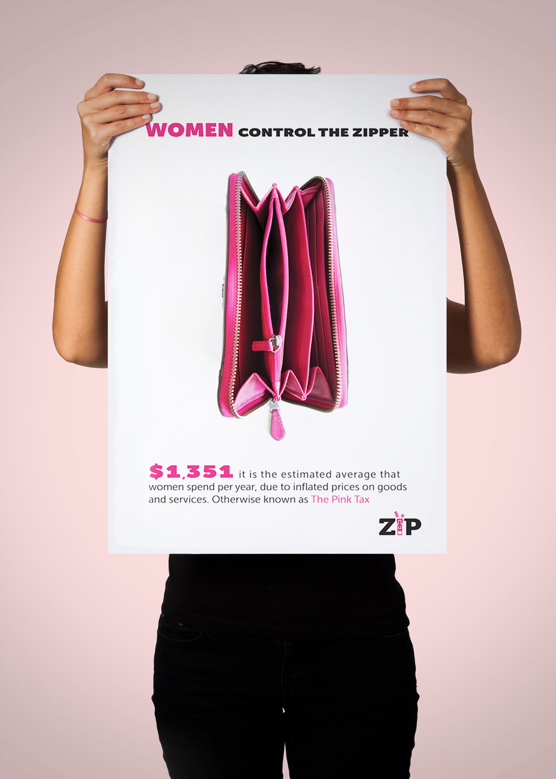
The Sans Serif font stands out to convey a clear message and the addition of statistical information further underlines that it's time for women to be aware of the problem, claim their worth, and take back their purchasing power.
And finally, the colors attributed to gender difference is one of the most obvious stereotypes — determining the color of clothing and accessories. The choice to use pink, in this case, strongly studied and it was used to emphasize the name of the tax itself (Pink Tax) and criticizes the fact that pink is identified as the female color. Marketing consolidates the "feminization products" through the use of pink.

This project is commenting on consumerism and the stereotyping of target audiences as the worst enemy of “gender theories”. The ZIP campaign reclaims pink—today this color becomes an ally. Not surprisingly, pink is in fact, the symbol of the feminist movement, as well as that of breast cancer prevention.